


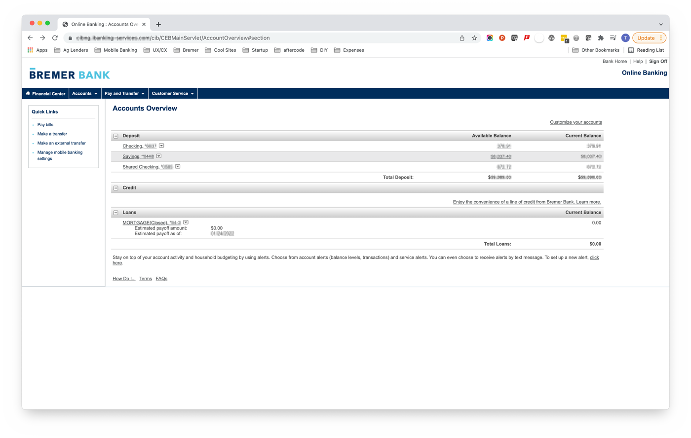
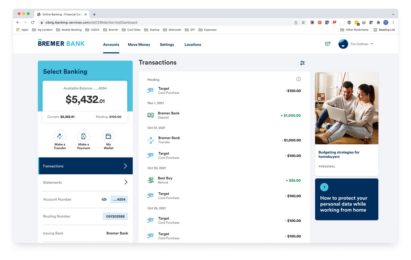


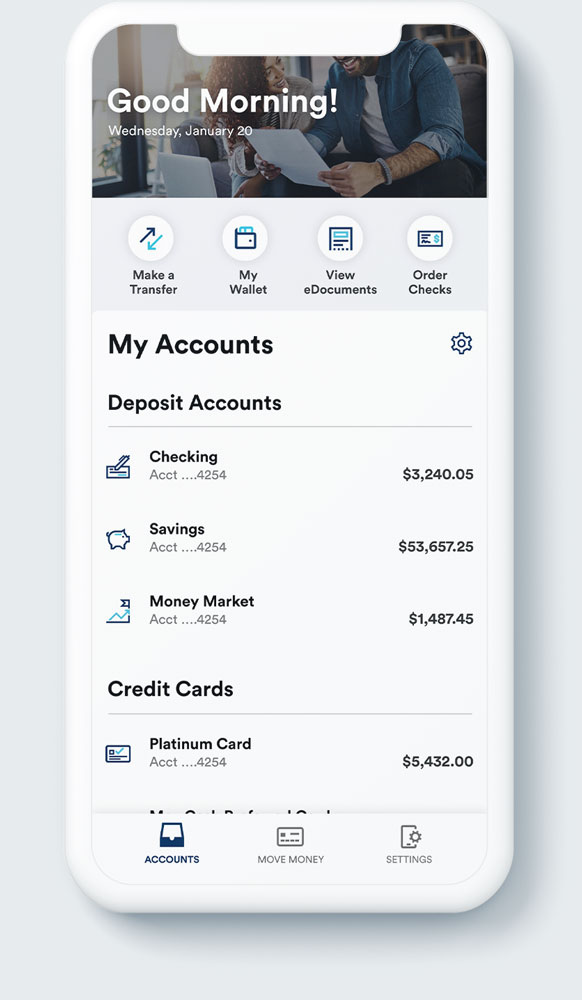
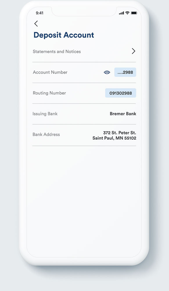

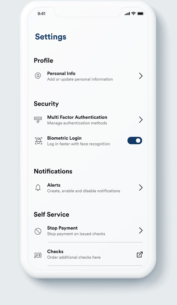

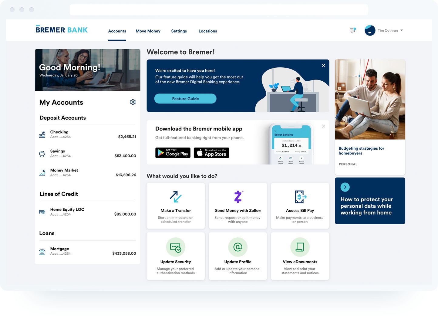
Column ported directly from mobile design
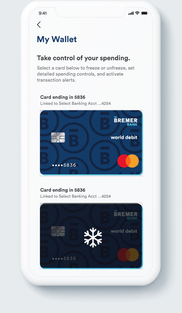
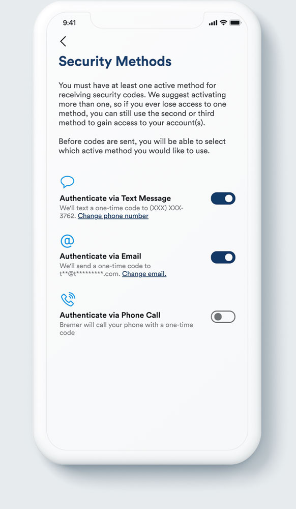
Column ported directly from mobile design
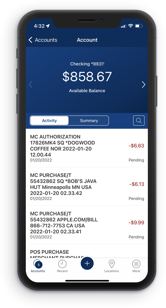
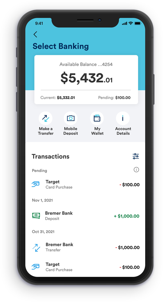
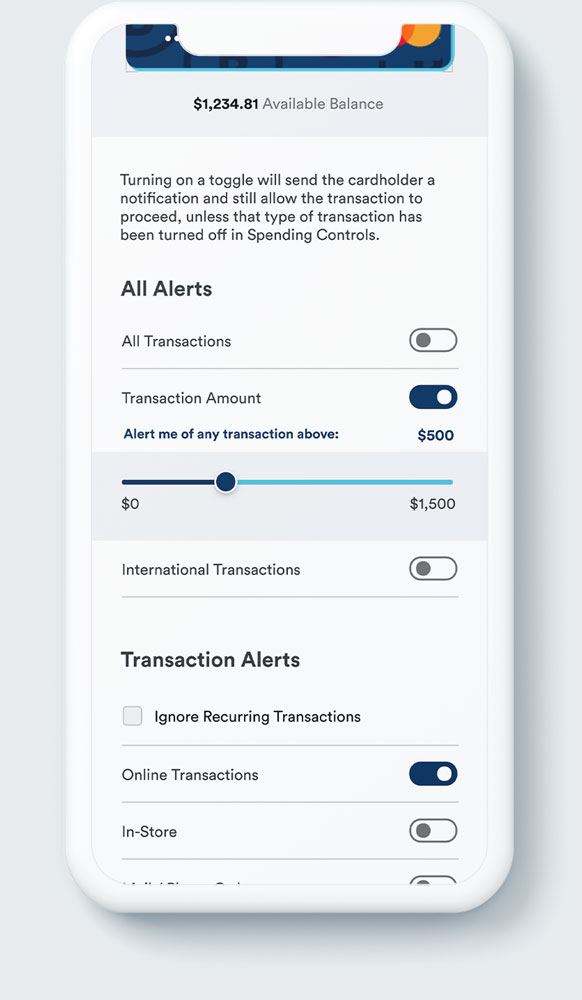
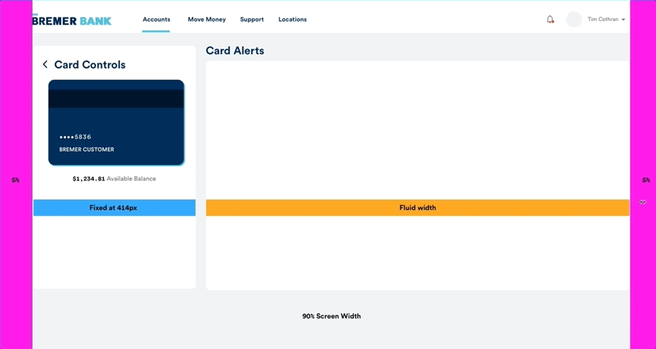
Horizontally responsive mobile layout
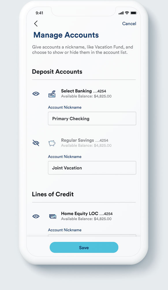
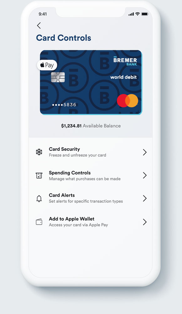
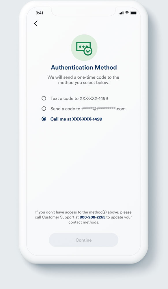
Column ported directly from mobile design
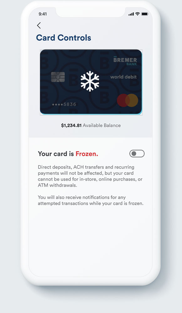
Column ported directly from mobile design
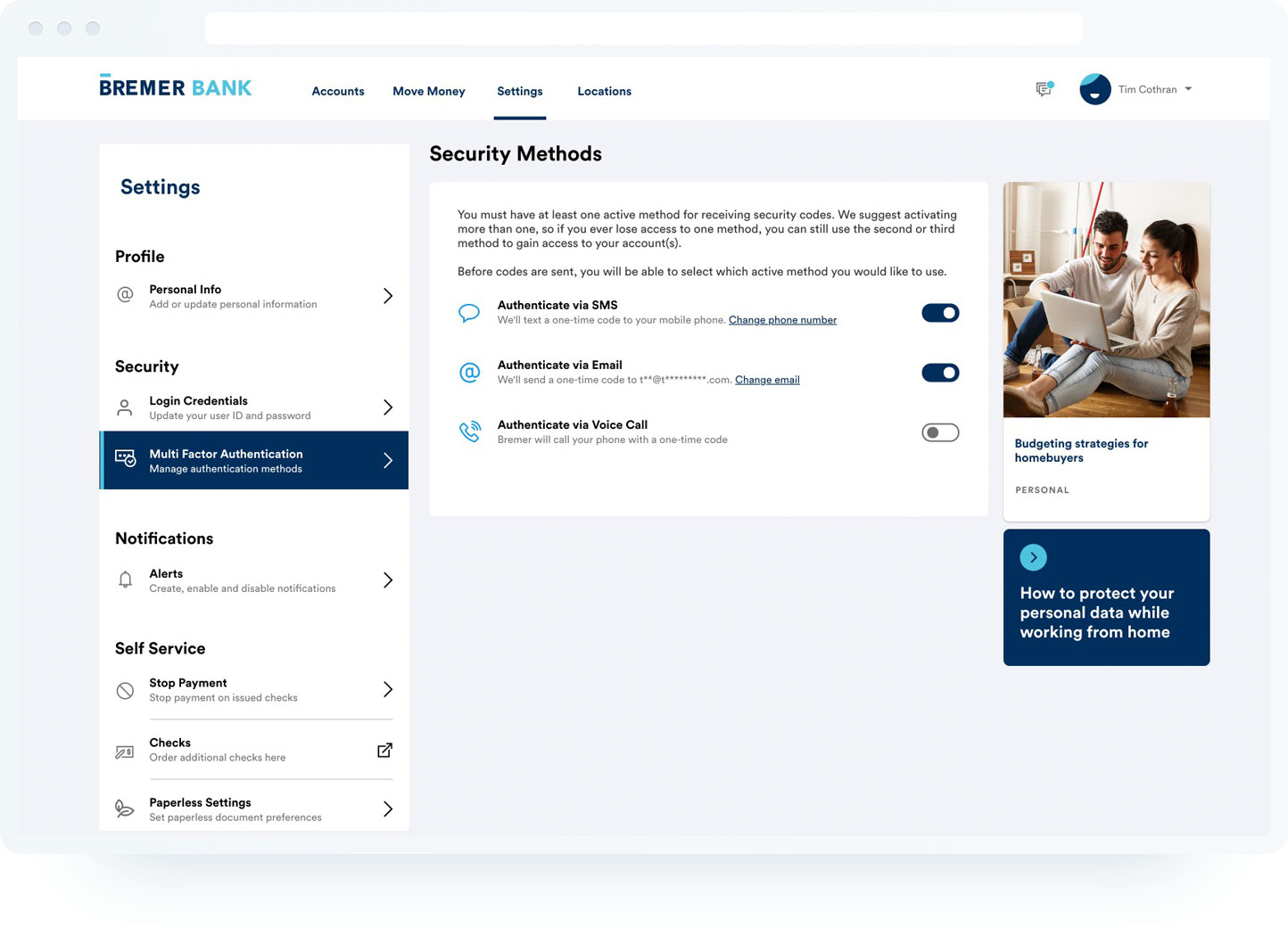
Column ported directly from mobile design
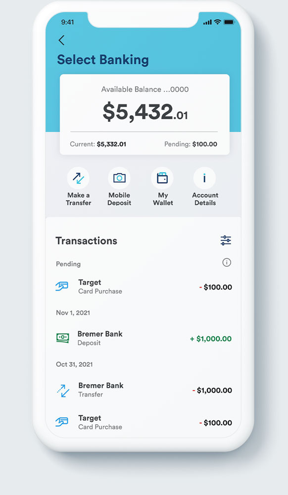
Horizontally responsive mobile layout