As the first employee and sole designer at Rambl, I've been involved in every aspect of the company, including branding, messaging, pitch decks, marketing and advertising, copywriting, prototyping, UX and UI, email campaigns and blog design, video creation and social media branding.
Joining a company at ground zero, starting a product from scratch, identifying product/market fit and ultimately gaining traction with our target market has provided me more insights in the last three years than I've gained in the last 10. To be fair, it was probably aided by the fact that the company was started by 2 of the former founders of one of the most successful tech companies in Minnesota in the last 20 years, of which I was also a part of...just not quite as early.
Below are links to early versions of our product charter and brand messaging exercise. These were done by myself and Bill Galfano, which had they been outsourced, would have cost our startup far more than we could afford, and frankly, are as good - if not better - than what I've paid for at past companies.
VERY early charter doc
Brand Strategy Exercise
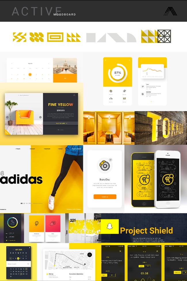
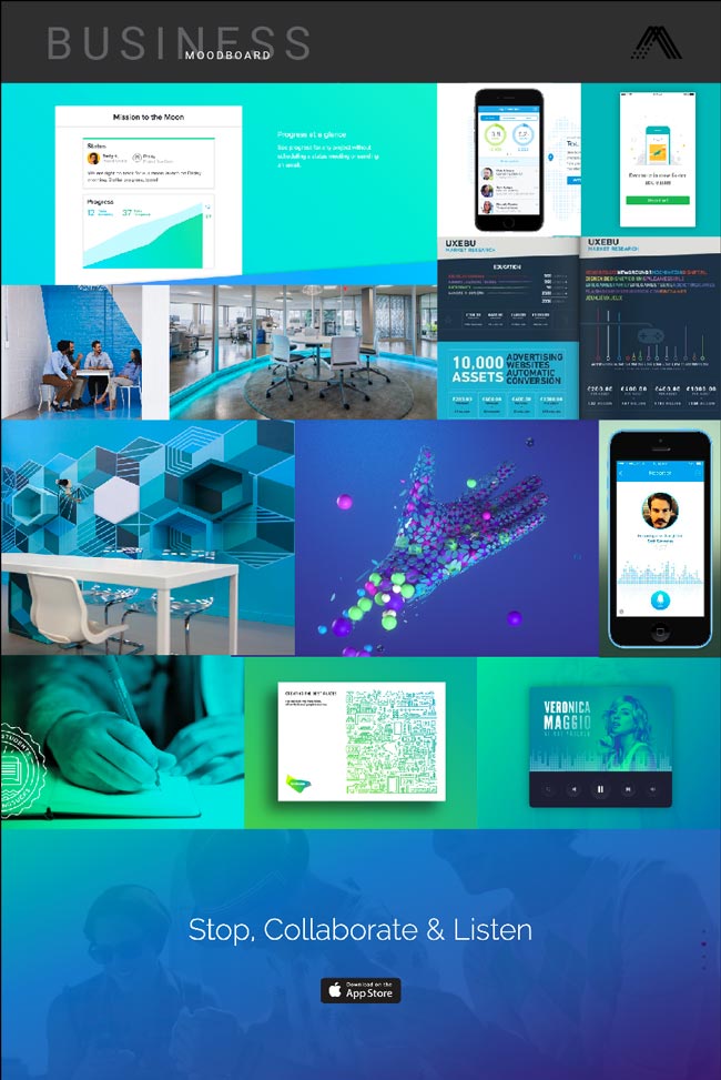
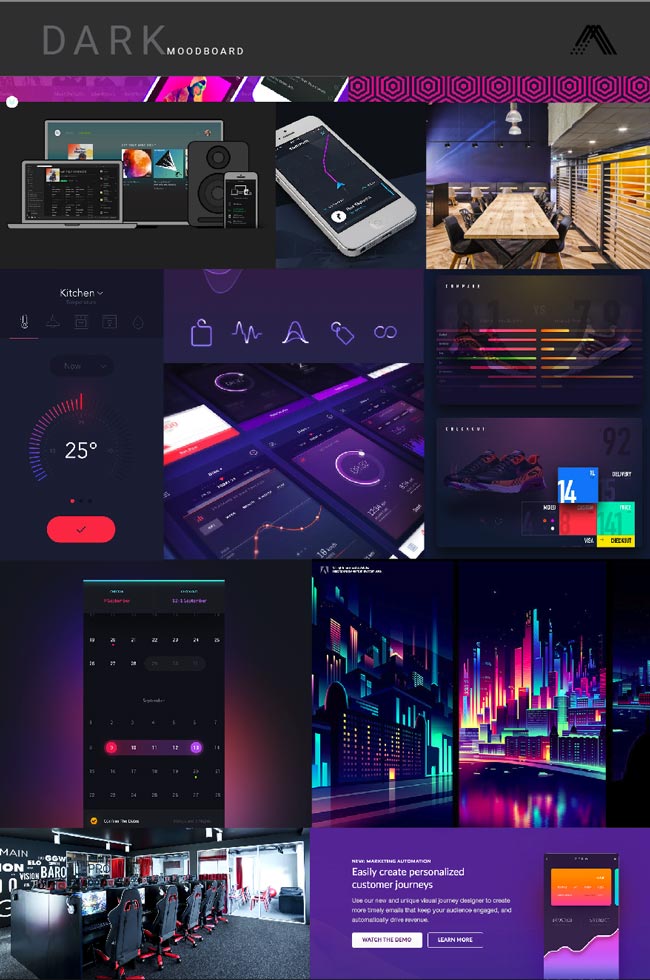
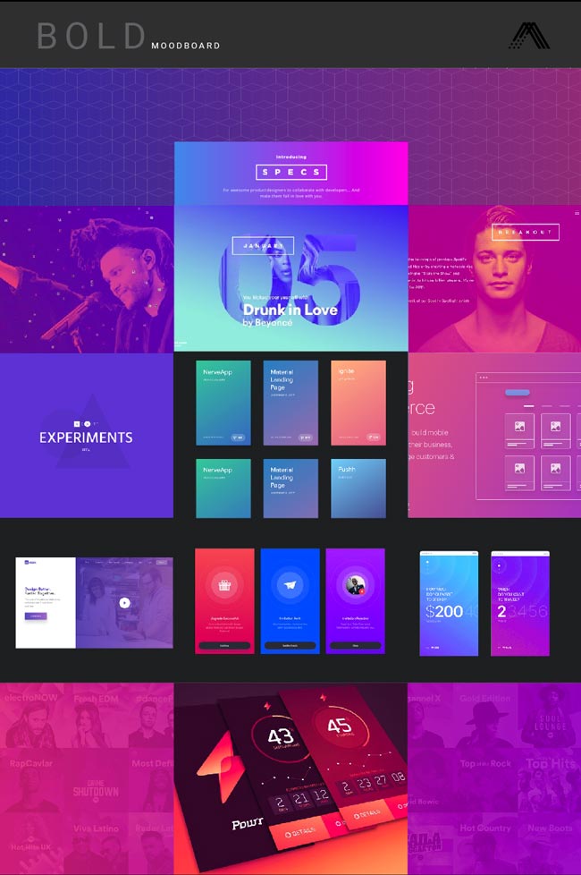
Rambl mood boards
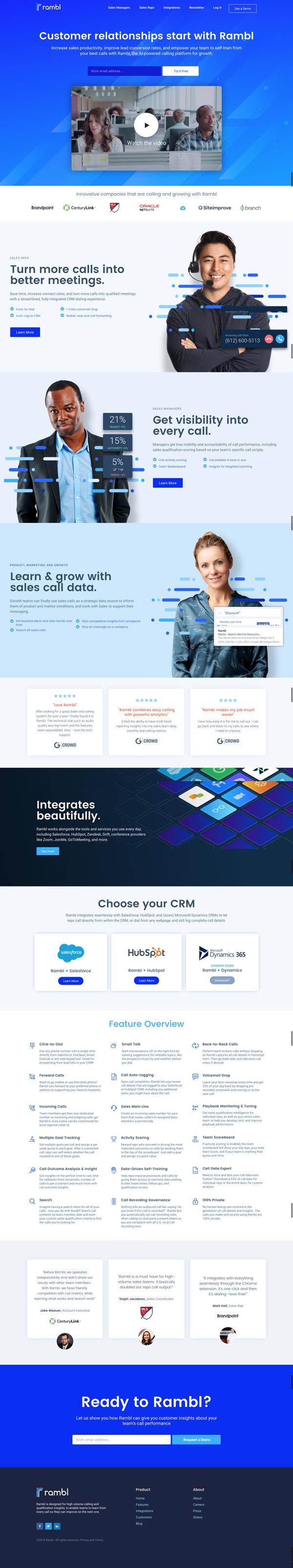
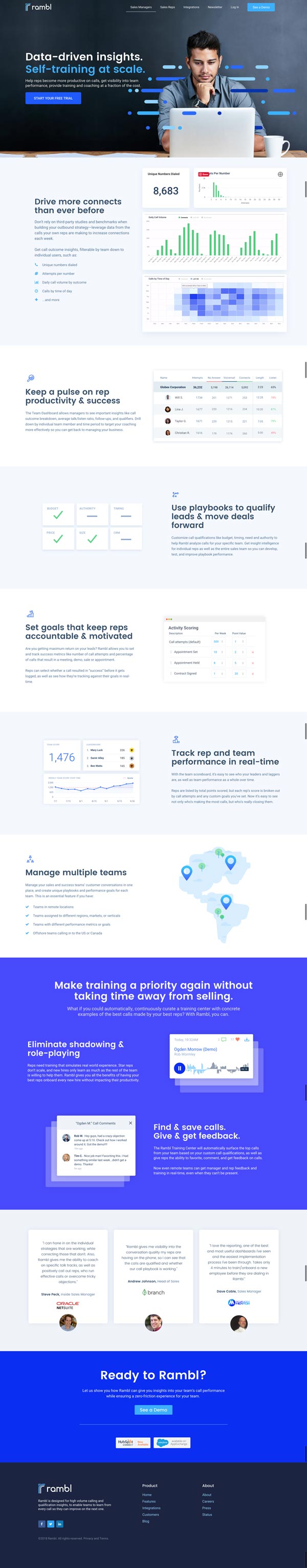
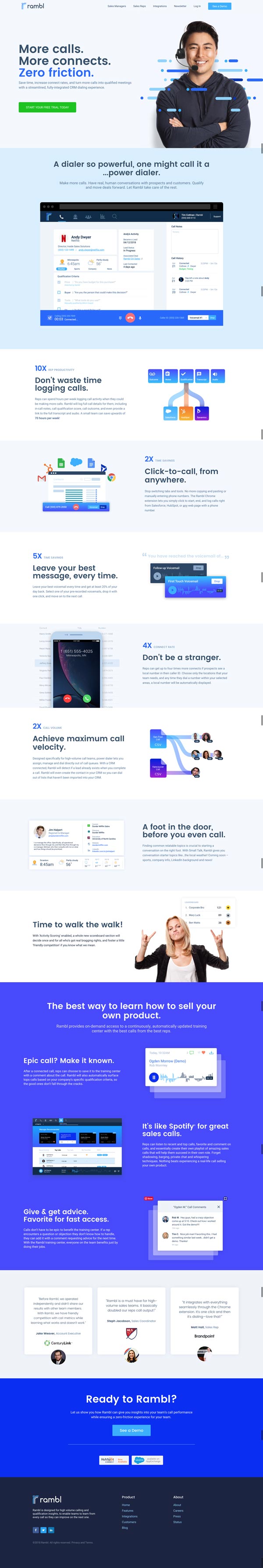
Branding evolved as the product evolved, but we did need a starting point for the public site when we launched on Product Hunt in March 2018. Below are a selection of mood boards that served as a starting point for the visual direction of the marketing site.
brand identity
The brand identity was initially designed to look like a part of the Aftercode brand. The idea was that we took unstructured data (the dots and dashes) and processed them to into machine understandable data, then pulled out the parts that were pertinent to the user, and which formed the shape of an 'r". Amazing, right? 😉
However, we learned during a HubSpot™ partner conference that the mark did not hold up at small sizes on powerpoint slides, so it was simplified and made slightly bolder and more compact.
This is not a 'great' video, BUT it was scripted, voiced, and produced in 24 hours by myself for the 8% Nation conference. After seeing it, our CEO decided it was worthy of the homepage. This is a prime example of the level of quality at speed that can't be easily outsourced.
early prototypes
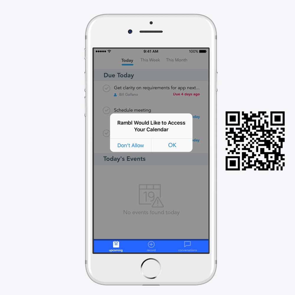
I had used Invision many times to create prototypes, but at the time I had heard that Protopie could actually hook into the phone sensors for a more realistic prototype experience. The following prototypes were created in just a day or two, and provided invaluable feedback based on their realistic functionality. If you'd like to try them out, I suggest downloading the Protopie mobile app for the best experience.
process
Considering how much the product has changed since conception and how many iterations there have been, finding meaningful examples of the UX process proves difficult. However, I think one of the last features we worked on is one of the best examples, as well as one of Rambl's biggest potential differentiators in the market.
feature validation
Prior to creating or coding anything, we developed a story around the training center and created a private landing page as though the feature was complete. We tested the messaging and proposed functionality on our existing beta users and prospective customers to understand if the training center would meet their needs, what it lacked, and how to prioritize feature development based on their feedback. This landing page method was hugely valuable in proving out the value of future product features.
user flow
We created two versions of the user flow. The first version would automatically populate the training center with any call that resulted in a demo - thus considered a good call. The second version of the user flow would allow a user to decide whether the call was worth adding to the training center, and if so, they would be required to add a comment stating why, so other reps would know why that call was worth listening to.
USER interface
The initial layout of the training center was based on automatic population of the list without the reps needing to spend time after the call writing notes. Calls that made it into the training center were weighted according to outcome and qualification detection, so higher quality calls (according to our algorithm) would be easier to distinguish.
After beta testing the training center with a few select customers, we realized that the problem wasn't with getting calls into the training center, but understanding exactly what made the call worthwhile. Since this was intended to replace / supplement manager training, we needed to ensure that only the best calls were being selected, and because reps don't have a lot of time, we also needed to make it clear why they should listen to each call.
Version 2 of the training center allowed reps to manually choose to add a call to the training center, and if they did, were required to leave a note about the call which would appear in the list, which had been modified into a card layout so notes were easily readable.
ABOUT ME
I've worked in 2-person agencies and 2,500-person enterprises. I've been the 1,000th person to join and work through the difficulties of a major M&A rebrand. I've also witnessed the challenges of joining at 13 and growing to 500 in less than 4 years. And recently I've gained immense insights from starting from scratch as the first employee, developing a value proposition, identifying product/market fit, and iterating over and over...and over...on messaging and product features. I've worked for clients in healthcare, insurance, medical technology, telecom, SaaS, retail, and non-profit sectors.